Quantcast
Channel: The Pen Addict
Viewing all 3013 articles
Browse latest View live

Esterbrook JR Pocket Fountain Pen Review

$
0
0
Esterbrook JR Pocket Fountain Pen Review

(Jeff Abbott is a regular contributor at The Pen Addict. You can find more from Jeff online at Draft Evolution and Twitter.)

If you've ever been to a pen show, you've certainly seen a few Esterbrooks on the tables of various vendors. Back in the 40s, these pens were as ubiquitous as the Bic ballpoint or Pilot G2 gel pen today. They were affordable, dependable, and offered enough variety to match your personal sense of style. Even today, decades later, they still work and offer a fantastic writing experience as long as they've been cared for and/or restored properly.
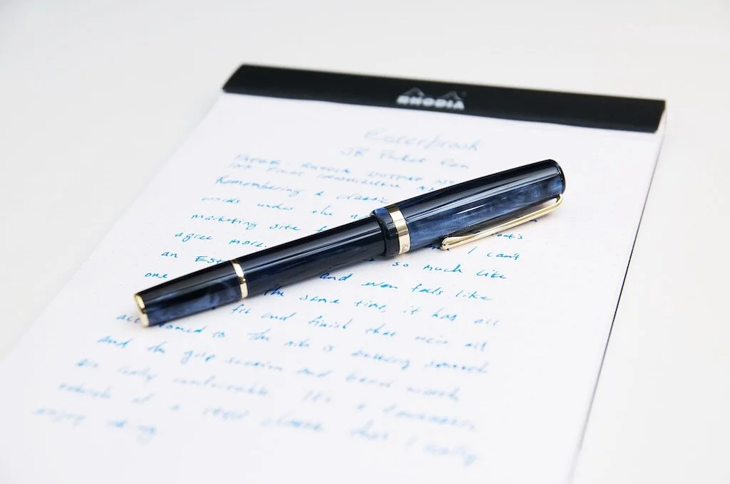
Esterbrook JR Pocket Fountain Pen

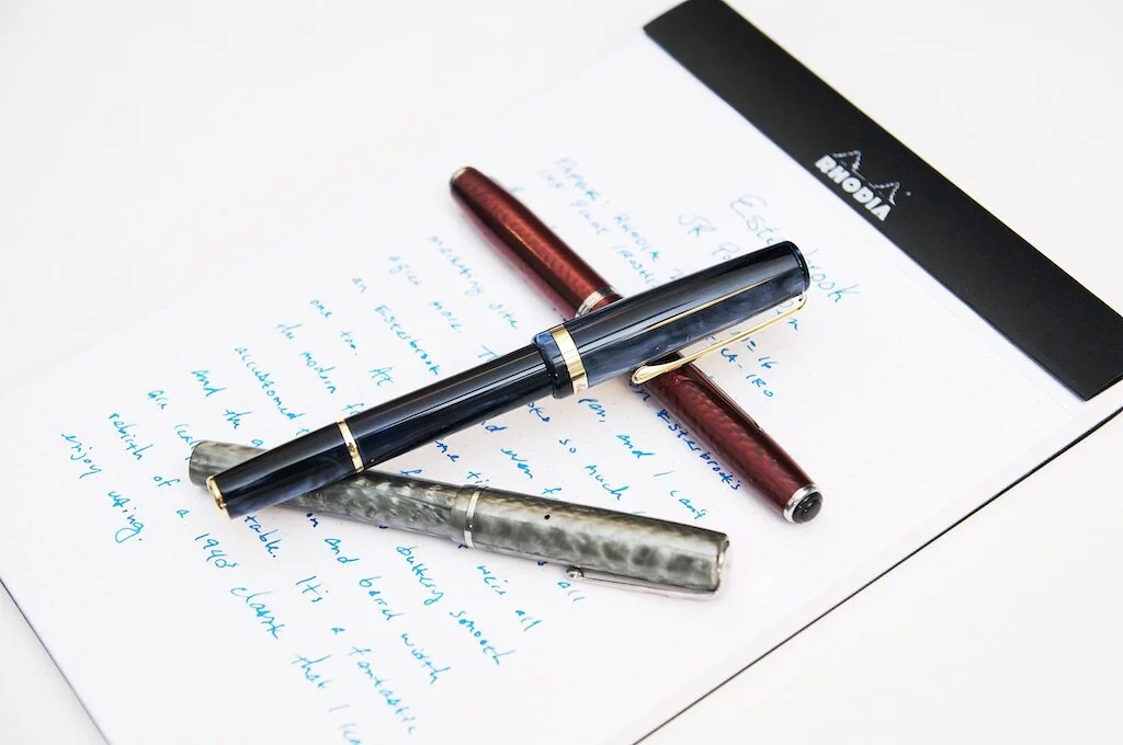
Esterbrook has made a comeback in the past couple of years. Under the ownership and direction of Kenro Industries, this classic brand has been reborn into the 21st century. This idea of rebirth runs deep in the company's new vision, and is baked into the name of their JR Pocket Pen. Modeled after the classic Esterbrook J, this petite pen bears a striking resemblance to the J while also offering the amenities that modern manufacturing and materials provide.
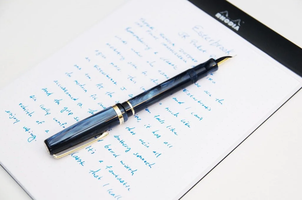
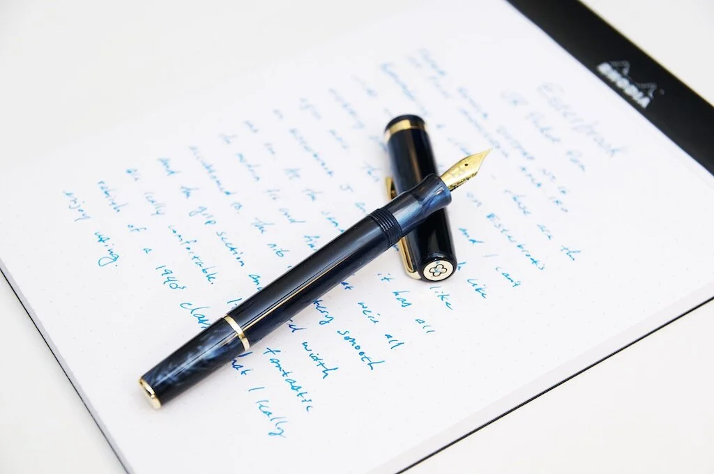
Esterbrook JR Pocket Fountain Pen Barrel

If you've ever handled an Esterbrook J, you'll know just how petite and slim those pens are. The JR doesn't fall far from the tree in this case. The body of the pen is just as slim as the classic J, and it's similarly lightweight and comfortable to hold while writing. One small deviation from the original that I'm still not sure about is the cap. It's quite a bit larger in diameter than the body of the pen. While this doesn't change anything functionally, it does make it look a bit different than the original J. That being said, there's no reason that the JR has to be a complete replica of the original J. This pen is quite attractive as an individual piece of art, and I completely adore how it looks on my desk. Any decision to deviate from the classic form — either aesthetic or functionally — is completely acceptable because this pen is just what Esterbrook says in their marketing materials: a rebirth of the J.
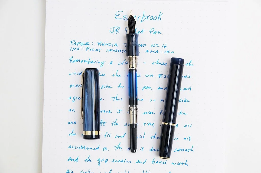
Esterbrook JR Pocket Fountain Pen Converter

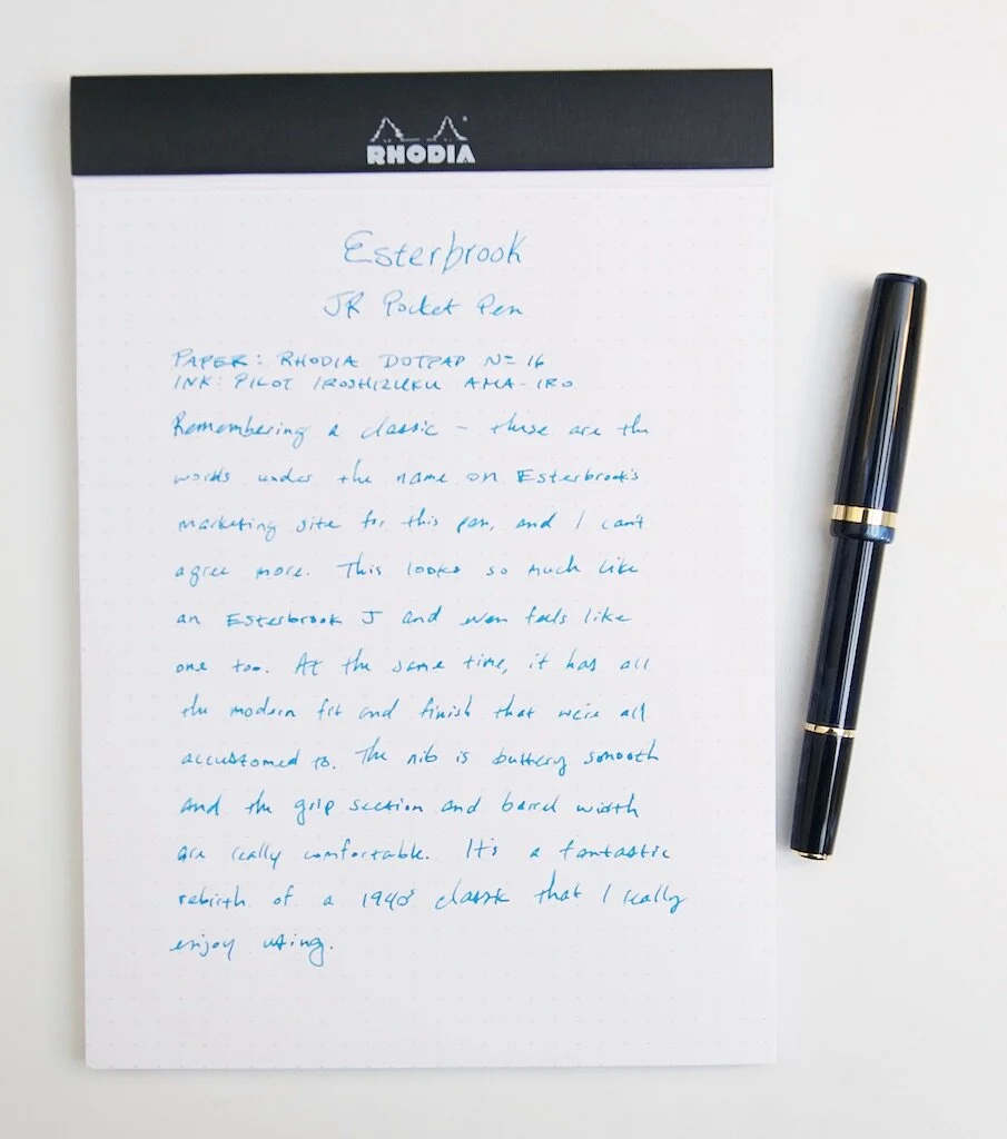
Writing with the JR is quite a pleasant experience. The lightweight acrylic is comfortable to hold and quickly warms up to your touch. The grooved section has a convenient place to rest your fingers while writing and is small enough to stay out of your way if you use a different grip. I've used this pen for some fairly long writing sessions, and it's been extremely comfortable.
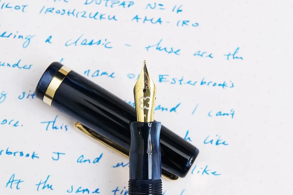
Esterbrook JR Pocket Fountain Pen Nib

The nib is what really stands out to me on this pen. It's a medium point, but it's just so smooth and crisp. Writing with it is such a pleasure because of how smoothly it glides across the surface of the paper. Straight out of the box, it was a fantastic writer and I'm always really appreciative to this level of quality control and attention to detail.

Along with everything else that makes this pen so great, the colors and materials are so pretty. I have the Capri Blue version with gold trim, and the depth and variety of blues in this material is gorgeous. I still think it would look amazing with paladium trim and wish that was an option, but the blue and gold combo is also quite nice. I've found myself staring at this pen and discovering new pockets of color under the surface of the body that just fascinates me.
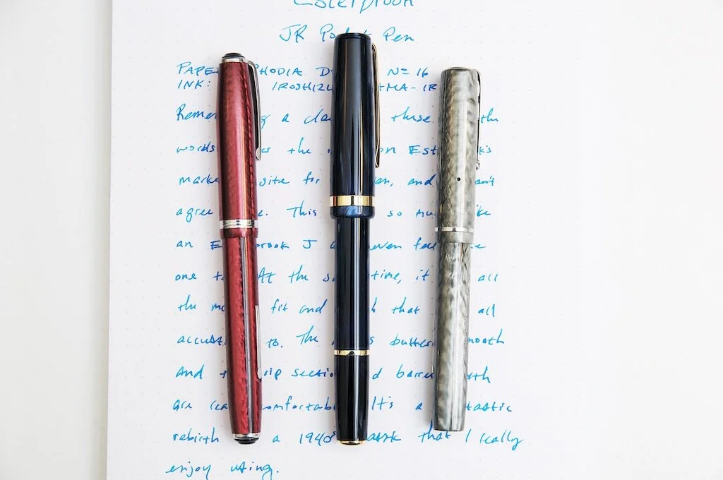
Esterbrook JR Pocket Fountain Pen Comparison

Along with Capri Blue, you can also choose from Carmine Red and Tuxedo Black. Each color has a similar depth of color and shading that adds a lot of visual interest to the pen.

The MSRP for this beauty is $175, but you can normally find it for about 30 bucks cheaper. I think this is a fair price considering the buttery smoothness of the nib, the quality of the body/cap materials, and the amount of finish and attention to detail that went into this product. Oh, they also include a nice box and a full size cartridge converter as well so that you're ready to ink it up and go as soon as you get it out of the box.
Esterbrook JR Pocket Pen

The Esterbrook JR Pocket Pen is an adorable and highly useful reincarnation of the classic Esterbrook J. It doesn't matter if you're new to Esterbrook or just trying out the reborn offerings, this is a fantastic representation of what I think the traditional brand offered. It's a well-made pen that look sharp and writes beautifully.

(Kenro Industries provided this product at no charge to The Pen Addict for review purposes.)


Enjoy reading The Pen Addict? Then consider becoming a member to receive additional weekly content, giveaways, and discounts in The Pen Addict shop. Plus, you support me and the site directly, for which I am very grateful.

Membership starts at just $5/month, with a discounted annual option available. To find out more about membership click here and join us!
Esterbrook JR Pocket Pen Review

Ugmonk Analog Cards Giveaway

$
0
0
Ugmonk Analog Cards

I was a backer of the Ugmonk Analog System on Kickstarter, but as they say, “I did it all for the holder!” Ok, it’s just me who says that, and it’s true. I wanted the note card holder to add to my various other note card storage accessories, knowing that I could give away the system cards.

I have one monthly pack to give away to each of three winners of this giveaway, so read the rules below and enter away.

Ugmonk Analog Cards Giveaway

The Pen Addict Podcast: Episode 442 - Instead I Got a Monitor Stand

$
0
0
“ALIENS,” via    Retro 51   .

“ALIENS,” via Retro 51.

Did you get any new stationery over the holidays? Me? Well, let’s just say I took care of that myself. Myke and I reconvene after the Christmas break and try to sort out what Retro 51 is doing, what paper will replace Tomoe River, and my decision to rage clean my pens.

Show Notes & Download Links

This episode of The Pen Addict is sponsored by:

Squarespace: Make your next move. Enter offer code PENADDICT at checkout to get 10% off your first purchase.

Pen Chalet: Click the ‘podcast’ link at the top of the website and enter the password ‘penaddict’ for this week’s special offer, and to get your code for 10% off.

ExpressVPN: High-Speed, Secure & Anonymous VPN Service. Get an extra three months free.

A Stationary 2020 of Stationery

$
0
0

(Sarah Read is an author, editor, yarn artist, and pen/paper/ink addict. You can find more about her at her website and on Twitter. And check out her latest book, Out of Water, now available where books are sold!)

Here we are at the end of 2020, with 2021 looming. Perhaps rather than a sparkling ball, we'll be dropping the other shoe. But, as Galadriel says, "Hope remains while the company is true" and there's no better company than the stationery community. A lot of us have sought solace and sanity in our hobby and in each other this year, and despite my analog disposition, I'm so grateful for the tech that has kept us in touch.

Whether it was Twitter, Instagram, or Brad's Twitch streams, reaching out to my pen fam helped dull the sting of lost pen shows and clubs. And thank goodness for online pen stores and the mail carriers who make them possible. I didn't save any money by not going to a pen show, that's for sure. Instead of the Chicago Pen Show, it was the Sarah's Mailbox Pen Show. I regret nothing.

Highlighters

A number of my 2020 acquisitions deserve a special shout-out. And my first accolade goes to the noble highlighter. I started grad school this fall, studying Library and Information Science. As you can imagine, there's a bit of reading in that field. I burned through 2-3 highlighters a week for my 14-week semester. Some were too dry, or too wet, or too awkward to hold, or ran out too quickly--but they all were necessary and I never went anywhere without a few of them. I could not have functioned without them and they were absolutely necessary to a successful semester. I raise my glass to you, highlighters.

Clipboard contents

My highlighters' constant companion was the King Jim Magflap Clipboard. A lot of my reading was scholarly articles that I'd printed out, and this clipboard made reading them a lot easier and more comfortable. I could curl up in a cozy chair and still have a reading and writing surface, and it fit perfectly in my bag when I needed to take my work on the go.

My third accolade, also used for school, was the Roterfaden Taschenbegleiter. It held the notebooks I used for lecture notes. The clip system, which I expected to be obtrusive and possibly even annoying, is actually fabulous. It's much more secure than an elastic band notebook system, and the clips never got in the way at all. I've already got it refilled for next semester.

Galen Medic Bag

Clearly the majority of my praise is going to practical things--in the year 2020, I most appreciate the things that made my life easier. But don't worry, it's not all school supplies. My absolute favorite stationery item I got this year was my birthday/mother's day present from my husband, a long-coveted Galen Leather Writer's Medic Bag in crazy horse green. In the stationary year of stationery it mostly sits on my desk, holding pens and looking pretty. But it is SO pretty, and sometimes I carry it around the house with me. You know, in case I want to write upstairs, or in the kitchen while I make more tea. I can't wait to take it to a pen show, though I know that may not be till 2022.

Spoke Roady

My favorite pen of the year was the Spoke Roady, and I'm not just saying that because Brad is my friend. It's a phenomenal pen and I've used it every day since it arrived. If there's one thing to look forward to in 2021, it's more Spoke pens.

I think there's a lot to look forward to in 2021, though. Maybe not all the things we normally look forward to, but I know I'm looking forward to chatting with you all about pens and paper and ink for the coming year. Take care and Happy New Year!

December Sponsor Spotlight

$
0
0
Sailor Pro Gear Slim Mini, via Goldspot.

Sailor Pro Gear Slim Mini, via Goldspot.

Sponsor support is very important to me here at The Pen Addict. My sidebar advertisers put their faith in me to deliver good value for them month in and month out, and I want to shine the light on the best of the best for you. If you are shopping for pens, paper, inks, and more, please check out these great companies and see what they have to offer. Some recent highlights:

Pen Chalet has their big year-end sale underway, featuring markdowns and discounts galore.

Goldspot received six new colors of the Sailor Pro Gear Slim Mini, which is one of my favorite pocket-sized fountain pens on the market.

Vanness Pens has the last Retro 51 Tornado Popper of the year in stock, and it’s … ALIENS!

JetPens has the new Kokuyo Mark+ 2 Marker Pens in stock, which are a perfect compliment to your planner heading into 2021.

Scribo Verde Mediterraneo Ink: A Review

$
0
0
Scribo Verde Mediterraneo Ink Review

(Susan M. Pigott is a fountain pen collector, pen and paperholic, photographer, and professor. You can find more from Susan on her blog Scribalishess.)

Scribo ink arrives in a gorgeous, cloth-covered box. The box is substantial because the ink bottle is made of thick glass. Filled with ink it weighs a whopping 441 grams/15.5 ounces.

Scribo Verde Mediterraneo Ink Box
Scribo Verde Mediterraneo Ink Glass

Verde Mediterraneo is a deep teal green with shading and a good amount of red/burgundy sheen. On my Col-o-dex card, you can see the various shades of the ink in the swab, the shading properties in the writing and swirl, and the sheen in the splats.

Scribo Verde Mediterraneo Ink Colodex

I tested the ink on white Rhodia dot-grid paper. It writes smoothly and demonstrates shading in all nib sizes. Although the ink dried super fast, it didn't seem dry when I wrote with it. In fact, it flowed quite nicely and is well saturated. It isn't waterproof.

Scribo Verde Mediterraneo Ink Rhodia

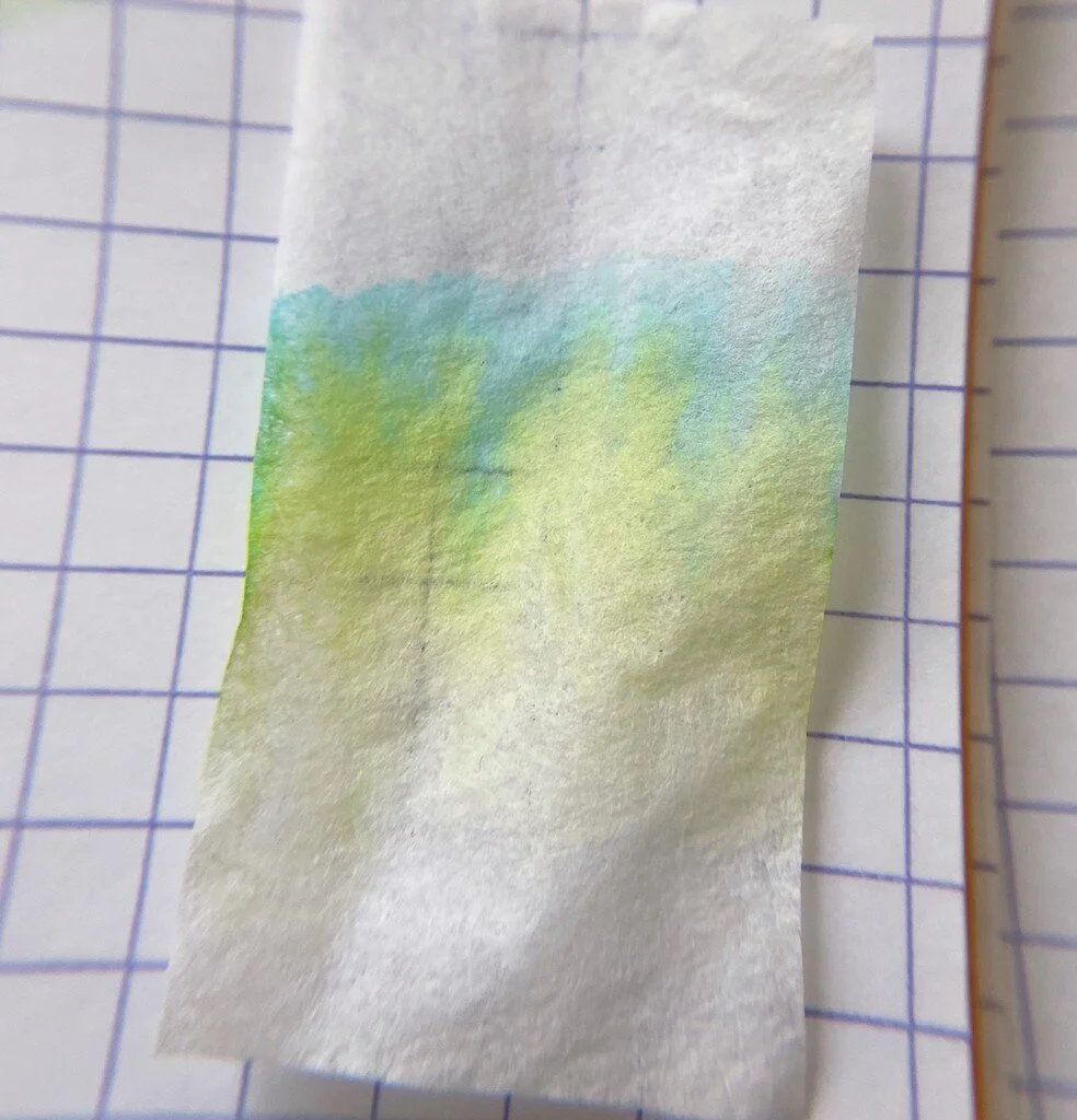
Chromatography reveals a bit of pale yellow and ochre, turquoise and blue.

Scribo Verde Mediterraneo Ink Chromatography

On MD Cotton Paper with my Handwritmic ruling pen you can see shading and sheen, especially where the ink pooled.

Scribo Verde Mediterraneo Ink Writing

For a lengthier writing test, I used an MD Notebook Journal and my TWSBI Prussian Blue fitted with a Mark Bacas Predator nib. The ink was wet and flowed well. You can even see a bit of the red sheen.

Scribo Verde Mediterraneo Ink Long Writing
Scribo Verde Mediterraneo Ink Longer Writing

I also drew a design modeled after a pattern by @mgemart_ on Instagram. This was done in my Galen Leather Tomoe River Journal. Again, the ink worked well on the paper, although you can see a difference between the left and right sides. The left side is more saturated (presumably because I had just inked the pen). The right side was completed the following day and is much lighter.

Scribo Verde Mediterraneo Ink
Scribo Verde Mediterraneo Ink Pattern

Scribo Verde Mediterraneo is an excellent dark teal ink. It reminds me most of Sailor Yama Dori, but the Scribo ink is much greener.

You can purchase this ink from Goldspot Pens ($39.00 for 90ml), although it is currently sold out. I would suggest trying a sample first just to make sure you like the color, since $39.00 is quite an investment. I suspect that price is partly due to the fancy glass bottle, which, by the way, is stackable with other Scribo bottles. I'm not sure how helpful that feature is (at least for saving space) since the bottles themselves are so massive.

(Goldspot provided this product at no charge to The Pen Addict for review purposes.)

Scribo Verde Mediterraneo Review

Ugmonk Analog Cards Giveaway Winners

$
0
0

Note cards are a great way to track your day and organize your thoughts, and the new Ugmonk Analog System Note Cards are set up to help with exactly that. I had three sets of cards to give away, and the winners are:

Ugmonk Analog Cards Giveaway Winners

Congrats! I’ve sent an email to each of you to collect your shipping address.

Misfill, Looking Back, Moving Forward Edition

$
0
0
Looped Square

Each week in Refill, the Pen Addict Members newsletter, I publish Ink Links as part of the additional content you receive for being a member. And each week, after 10 to 15 links, plus my added commentary on each, I'm left with many great items I want to share. Enter Misfill. Here are this weeks links:

2020 in Inky Review Part 1: Personal Trends and Collection (Looped Square)

2021 Yearly Goals (New Year’s Resolutions) and Theme (Writing at Large)

Year Roundup: My Favorite Products Of 2020 (The Pencilcase Blog)

Fountain Pen Quest Year-end Roundup (Fountain Pen Quest)

My Ink Collection: 1266 Bottles and 61 Litres of Ink (2021) (Macchiato Man)

My fountain pen drawings in 2020 (Inkcredible Colours)

Looking ahead to 2021 (UK fountain pens)

2020 Cheers and Tears (The Well-Appointed Desk)

The Twins v2.0 // Pilot Kakuno Fountain Pen (Weirdoforest Pens)

Greatest of All Time 2020 (SBREBrown)

2021 Planner Set Up. (The Finer Point)

Biella Index Cards (pencil talk)

Mitsubishi WACOM Hi Uni Digital Stylus Review (Good e-Reader)

Ralph Steadman’s guided tour through six decades of irrepressible art (New Statesman)

Best Pens & Inks of 2020 (Fountain Pen Pharmacist)

2020: Some of my fountain pen highlights. (Fountain pen blog)

The Year in Walking, Ridgeline 2020 (Ridgeline)

Want to catch the rest, plus extra articles, reviews, commentary, discounts, and more? Try out a Pen Addict Membership for only $5 per month!


Left-Handed Pencils

$
0
0
Left-handed pencil

Did you know there was such a thing?

It seems that many of you had no idea. Neither did I until a few years ago, when I saw a pencil in my right hand with the text printed upside down. Yes, it is that simple. The legible orientation of a pencils stamping determines its “handedness.” Pretty cool, right?

Well, except if you actually are left-handed and would like a pencil to not look backwards in your hand. Lefties comprise approximately 10% of the worldwide population, but only a fraction of one percent in my admittedly unscientific study of the pencils in my collection.

Left-handed pencils

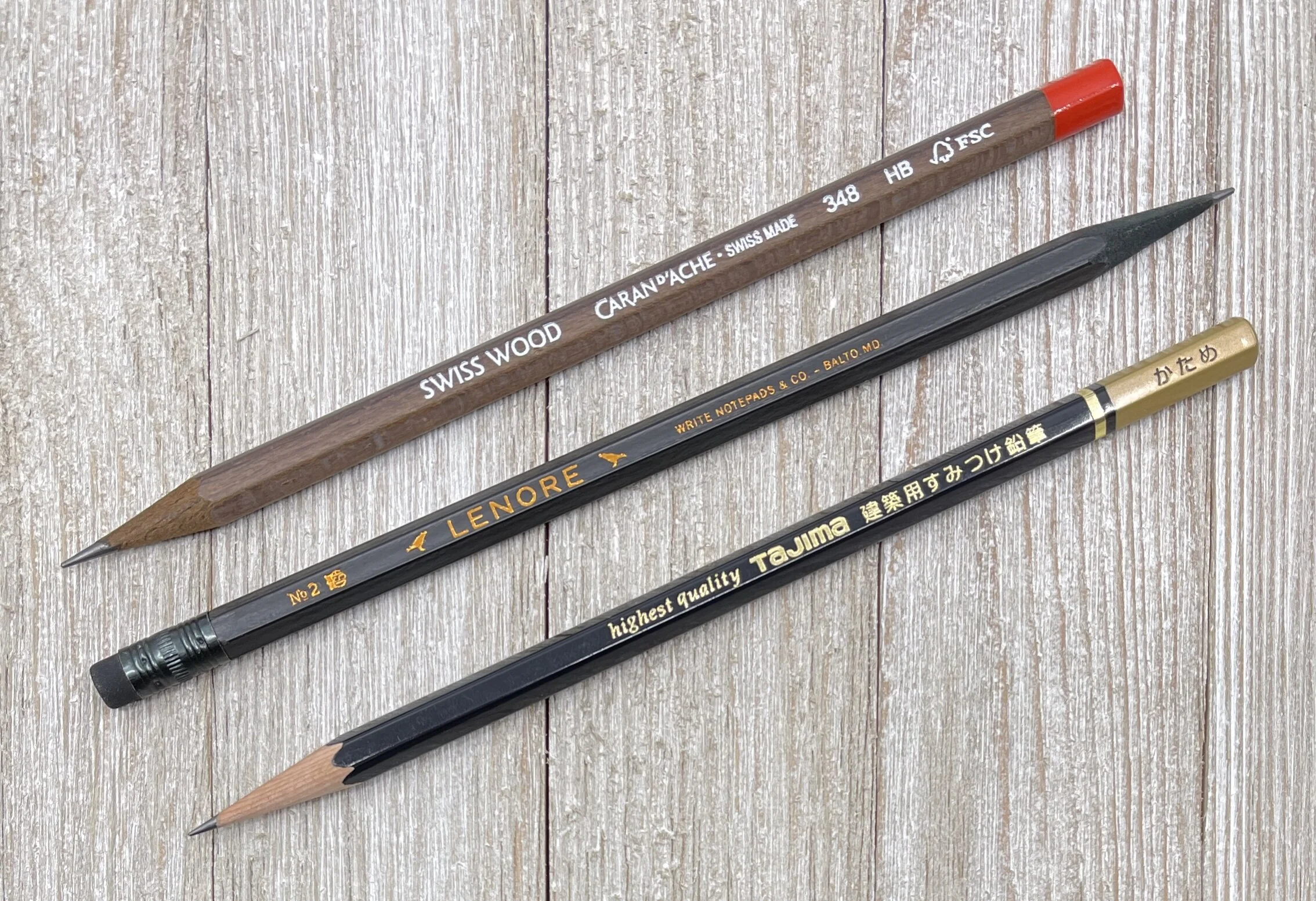
Last week, I pulled out well over 100 pencils from the Closet of Doom, and came away with one, ONE, pencil that was stamped for a left-handed writer. Do you know why? Because it came from Write Notepads. And Chris Rothe, owner of Write Notepads, is left-handed and wants his pencils to look correct when he uses them, darn it!

With one in every 10 possible pencil users writing from the left side, wouldn’t you think pencil manufacturers would cater to them a little more? Say, 10% of their production to left-handed barrel stamping? Or, stamp the opposite side of the barrel with the opposite oriented markings, making each pencil correct for every user?

Or, is this some type of Big Pencil conspiracy?

Write Notepads Lenore

Look, I’m not here to pretend I’m a lifelong lefty and have gone through all of the challenges lefties go through. But, I’ve been an honorary lefty for two months now, and there is more left-handed writing in my future, for at least another month or two. I want my pencils to look just as cool in my left hand as they do in my right!

Is 10% of production too much for you, Blackwing? Is the squeeze not worth the juice, Musgrave? How about you, Tombow? Set yourself apart from the competition in this area!

It’s time for pencil manufacturers to get right, and start making pencils for their left-handed fans.


Enjoy reading The Pen Addict? Then consider becoming a member to receive additional weekly content, giveaways, and discounts in The Pen Addict shop. Plus, you support me and the site directly, for which I am very grateful.

Membership starts at just $5/month, with a discounted annual option available. To find out more about membership click here and join us!

Lenore Edgar Allan Poe

Pentel Energel Kuro Gel Ink Pen Giveaway

$
0
0
Pentel Energel Kuro

During the holidays, the marketing department at Pentel of America sent over some amazing new products for early 2021. I’m excited for all of them, but none more so than the new slimmer-body Pentel EnerGel Kuro.

The Pentel EnerGel has always been one of the most popular gel ink pens on the market, and for good reason. The ink flows wonderfully, and the gel ink colors are amazing. But the traditional EnerGel barrel has always been a touch wider than most comparable barrels. The EnerGel Kuro brings the barrel diameter down into a more standard range (9.5 mm in the grip area vs 10.7 mm on the standard EnerGel,) and they are fantastic. So fantastic, that I am giving away a full set of 12 EnerGel Kuro pens before they become widely available later this month.

Read the rules below and enter away! And big thanks to Pentel for sending these great new pens my way.

Pentel Energel Kuro Gel Ink Pen Giveaway
Pentel EnerGel Comparison

Diamine Marine Ink Review

$
0
0
Diamine Marine Ink Review

(Jeff Abbott is a regular contributor at The Pen Addict. You can find more from Jeff online at Draft Evolution and Twitter.)

For the past few months, I've been trying to introduce more green into my fountain pen ink rotation. I wouldn't say I'm going all green all the time, but I am trying to include more green at a slow pace during these cold months. The latest ink I've been trying was supposed to be in this green genre, but it turned out to be a little more blue than I anticipated! Despite that error on my side, Diamine Marine is still a gorgeous blue-green ink that pops off the page.

Before getting into all the specifics of this color, it's fair to point out that this, like all other Diamine inks I've used, is extremely well-behaved and easy to use. The color is bright and accurate to their marketing swatches, and the price is really hard to beat. There's a reason I have so many Diamine inks in my collection at this point: they just work so well.

Diamine Marine Ink Swab

Marine is primarily a green ink, but it has a heavy blue undertone that you can't ignore. Diamine classifies this as a turquoise ink, but I'm not sure I agree. Any color in the realm of turquoise, teal, aquamarine, blue-green, green-blue, or other popular mixtures are highly subjective when it comes to naming and identifying the colors. To me, Marine looks more teal, but there are certain natural turquoise colors in nature that look just like Marine as well. It's a spectrum, and that just means there isn't one right answer! In this case, just know that Marine is a green-blue color.

Diamine Marine Ink Comparison

Questions of exact color aside, it's a gorgeous ink. I've really been enjoying using it because it makes me think of green (which is always a happy color to me), water, and also mint. The green is just light enough to bring out some mint comparisons, and the blue just adds a bit of depth to an otherwise flat color.

It's this additional depth of color that contributes to the minimal shading that this ink exhibits. Without the blue undertones, there wouldn't be much shading. Lucky for us, there's a good amount of color variation between light and dark strokes. This is more pronounced with larger nibs, but you can still see a good amount of variation with small or dry nibs.

Diamine Marine Ink Dry Time

One area that really surprised me with this ink is the dry time. I was anticipating something in the 15-second range, but I was really astonished when I discovered this ink was drying in the 5-10 second range depending on how wide/wet the nib stroke was. I'm still fairly shocked and impressed by this. It's hard to find any inks that dry that fast, let alone one with so much color saturation. If you're looking for a fast-drying ink and don't mine that it's a green-blue, this is a great place to start.

Like a lot of Diamine inks, you have several options regarding purchasing. With Marine, you can go for cartridges (box of 18), a 30ml bottle (my personal favorite), or an 80ml bottle.

(JetPens provided this product at no charge to The Pen Addict for review purposes.)

The Pen Addict Podcast: Episode 443 - Notes Passing Through the Night

$
0
0
Theme System Journal

I never thought I would be a habit tracker, until the Theme System Journal talked me into it. More importantly, I learned how to do it my way, which is the only way I’ll stick to it. Myke and I discuss my 2021 theme, how I use the Theme System Journal, my 2021 planner, and the one notebook that catches everything else.

Show Notes & Download Links

This episode of The Pen Addict is sponsored by:

Squarespace: Make your next move. Enter offer code PENADDICT at checkout to get 10% off your first purchase.

Harry's: Quality shaving and grooming products, at a fair price.

Van Dieman's Ink Sample Review, Part 1

$
0
0
Van Dieman's Ink Review

(Sarah Read is an author, editor, yarn artist, and pen/paper/ink addict. You can find more about her at her website and on Twitter. And check out her latest book, Out of Water, now available where books are sold!)

I have a small treasure chest of Van Dieman's ink samples to review! Which means reveling in multicolored inky fingers for weeks, and sharing the joy with you all. Here is the first installment of three reviews of this line of inks.

Van Dieman's Elizabeth's Violet Eyes
Van Dieman's Elizabeth's Violet Eyes Chromatography

First up is from their Hollywood series—Elizabeth's Violet Eyes, inspired by Elizabeth Taylor. It's a lovely balanced purple, not too warm or cool. It's well behaved and shows some nice shading. It's a wet ink with a longer dry time, and it survived with some faint lines remaining in the water drip test. This ink had some lovely chromatography, splitting from bright pink to magenta, to a bold turquoise. It's easily the most practical of the ones I reviewed for today, and while it's tame enough to be an everyday ink, it has a nice bit of excitement to it, too.

Van Dieman's Enchanted Woods Shimmer
Van Dieman's Enchanted Woods Shimmer Chromatography

The next ink I tried was the Enchanted Woods Shimmer from the Midnight series. This one is a bright emerald green with a silver shimmer to it. It's not shy on the bling, either. You could probably use this ink to signal passing airplanes. This ink has great character, showing some shading even through all that shimmer. It has a slow dry time, no water resistance, and the chromatography shows a beautiful yellow-green-blue progression. The ink description indicates that it is supposed to have a red sheen in addition to the silver shimmer, but I could not get one to materialize, even where the ink pooled.

Van Dieman's Ruby Slippers
Van Dieman's Ruby Slippers Chromatography

The third ink I tested somehow out-blings the Enchanted Woods. It's another from the Hollywood series, this one called Ruby Slippers. Wicked witches will no doubt be in hot pursuit of this ink. I don't recommend it for fountain pens, though, for several reasons. One, its very wet and feathers dramatically. Two, the particles settle almost immediately and require constant agitation to remain suspended. And three, it's highly water-resistant, and I'd be concerned about staining. Even in the ink description on the Vanness site it suggests dip and brush pens for this ink.

Van Dieman's Huon Midwinter Festival
Van Dieman's Huon Midwinter Festival Chromatography

The last one I reviewed this week was the insanely gorgeous Huon Midwinter Festival, from their Tassie Seasons line. This ink is enchanting. It's a rich sepia with an antique gold shimmer that makes me think of pirates. The chromatography for this ink was like watching a fireworks display--or a bonfire. From char brown to smokey purple to bright orange and yellow--this is clearly a complex ink. However, I strongly advise against using this in a fountain pen unless it it one that is easy to disassemble and clean. I let my sample vial sit for some time while I waited to get to this review, and when I picked it up to use it, I could not get the shimmer particles to come away from the plastic wall of the vial. Even with shaking, they stayed stuck. I had to knock the vial against my desk several times to get the shimmer to disperse. I assumed it was because it had sat for a few weeks. So I set it back down while I reviewed the other inks. When I picked this one back up to review, the same thing happened again, even though it had been sitting for less than an hour. I don't think these particles will behave nicely in a pen feed. For dip pens or brushwork, though, this is one of the prettiest browns I've ever used.

Van Dieman's Huon Midwinter Festival Sparkles

I still have six other colors to review, but my impression so far of the Van Dieman's inks is that they are very good with color, and all-in with their shimmer, but they fall more into the category of art-supply inks than writing inks. Which is not a bad thing--but I don't know if that is their intention. I do know that I would not put two of these four into a fountain pen. And I also have concerns about being hunted by flying monkeys.

(Vanness Pens provided this product at no charge to The Pen Addict for review purposes.)


Enjoy reading The Pen Addict? Then consider becoming a member to receive additional weekly content, giveaways, and discounts in The Pen Addict shop. Plus, you support me and the site directly, for which I am very grateful.

Membership starts at just $5/month, with a discounted annual option available. To find out more about membership click here and join us!

Franklin-Christoph 02 Intrinsic in Maya Blue with a Masuyama Medium Cursive Italic: A Review

$
0
0
Franklin-Christoph 02 Review

(Susan M. Pigott is a fountain pen collector, pen and paperholic, photographer, and professor. You can find more from Susan on her blog Scribalishess.)

I own several Franklin-Christoph fountain pens and have reviewed many of them on Pen Addict. I purchased a special edition Intrinsic back in May and realized I had not yet written a review of this model.

The pen is packaged in a simple white cardboard box and Franklin-Christoph's signature zippered pen case. Although these cases used to be made of leather, now they are made of "suit grey" fabric.

Franklin-Christoph 02

The 02 Intrinsic model is unique in its shape, with a barrel that tapers sharply from the center. This is so that the cap can post deeply onto the pen and maintain good balance--something that often fails on other pens when you post caps. This is the first fountain pen I use posted because of the ingenious design.

Franklin-Christoph 02 Barrel
Franklin-Christoph 02 Posted

I was lucky enough to get a special edition Intrinsic in Maya Blue. I love the colors of this model. There are darker translucent blue sections at the finial, top of the grip, and at the barrel bottom. The remainder of the pen is lighter blue and frosted.

Franklin-Christoph 02 Finial
Franklin-Christoph 02 Barrel End
Franklin-Christoph 02 Frosted

The pen is medium sized, measuring 146.1mm/5.75 inches capped, 149mm/5.85 inches posted, and 131mm/5.15 inches unposted. Without ink the pen weighs 20.71 grams. It's incredibly well balanced wither you use it unposted or posted, but I like the balance better with it posted (it gives the pen more heft).

Franklin-Christoph 02 Cap

The cap has a relatively small clip engraved with diamonds. The Franklin-Christoph name is also engraved lightly near the bottom of the cap.

Franklin-Christoph 02 Clip
Franklin-Christoph 02 Branding

The pen comes with two blue ink cartridges and is supplied with a Franklin-Christoph-branded converter. You can also eyedropper the pen if you wish.

Franklin-Christoph 02 Converter

The grip is comfortable even though there are threads near the top where the nib is inserted. The threads are raised and serve as a lip to keep your fingers in position. Once again, thoughtful design is evident in the details of the pen.

Franklin-Christoph 02 Threads

I opted for a steel medium cursive italic ground by Mike Masuyama. This is one of the best nibs I've received without additional tuning. It is absolutely stellar--smooth with crisp lines that offer good variation.

Franklin-Christoph 02 Nib 1
Franklin-Christoph 02 Nib 2

You can see that the down strokes are wide and the side strokes are thin as you would expect with a cursive italic.

Franklin-Christoph 02 Lines

I love how my handwriting looks with this nib.

Franklin-Christoph 02 Alphabet
Franklin-Christoph 02 Alphabet Close

The nib offers excellent flow and there's no skipping or hard starts. Writing with it is pure joy.

Franklin-Christoph 02 Writing

I created a pattern with the pen, primarily using the thin side strokes it produces. Not only is it great for writing, but it's also wonderful for drawing.

Franklin-Christoph 02 Pattern

Although you can't get the Intrinsic in Maya Blue anymore (unless FC decides to do another run), you can currently get the model in Black and Cinnamaroon, Ghost, and Smoke & Ice. It starts at $175 with stock steel nibs. You can opt for other variations, such as FC's "SIG nib" for an additional cost. Masuyama no longer does special grinds for Franklin-Christoph, but you can now get nibs ground by Nagahara for an up-charge of $25.00.

The 02 Intrinsic might just be my favorite Franklin-Christoph model so far. I love its unique shape and that I can post the cap without disrupting the balance of the pen. Maya Blue is a fantastic color with lovely contrasts between translucent dark blue and frosted light blue. If you are interested in getting Franklin-Christoph pens in special color combinations, you should sign up for their newsletter so you get advance notice of special releases.

(I purchased the FC 02 Intrinsic in Maya Blue with my own funds.)

Franklin-Christoph 02 Fountain Pen

Pentel Energel Kuro Gel Ink Pen Giveaway Winner

$
0
0

Pentel of America is kicking off 2021 in a big way with the launch of the new slimmer barrel Pentel EnerGel Kuro. I’ve been enjoying my set immensely so far, and I have another complete set of 12 ready to ship to the winner of this giveaway:

Pentel Energel Kuro Gel Ink Pen Giveaway Winner

Congrats Matthew! I’ve sent you a mail to collect your shipping address.


Misfill, Ink Edition

$
0
0
Ink

Each week in Refill, the Pen Addict Members newsletter, I publish Ink Links as part of the additional content you receive for being a member. And each week, after 10 to 15 links, plus my added commentary on each, I'm left with many great items I want to share. Enter Misfill. Here are this weeks links:

Ink Shimizu-cho / Oroshidanchi store (Mai-bun)

Video-Review: Pelikan M405 Silver-White (Scrively)

Ink Review #1349: Taccia Hokusai-koiai (Mountain of Ink)

Review: Parker Im Fountain Pen + Giveaway! (The Pencilcase Blog)

THE BAD DRAWING CLUB (Millie Nice)

East London women's community football club Hackney Laces unveils new kit designs with attitude (Creative Boom)

Last Call for "Old" Tomoe River? The Galen Leather Everyday Book (The Gentleman Stationer)

Ink Review #410: PenBBS #129 Xu Zhimo (Fountain Pen Pharmacist)

Mairead Case's Playlist for Her Novel "Tiny" (Largehearted Boy)

Staedtler’s weighty Premium Lignum fountain pen (UK fountain pens)

Remembering MF Doom: The Legendary Rapper Leaves Earth (Stereogum)

Sketchbook Design Goals (Writing at Large)

Monteverde Sapphire on Rhodia (Inkcredible Colours)

Japanese Designer New Year’s Cards of 2021 (Spoon & Tamago)

Brush Review: Pentel Design Fude Menso Brush - Small (The Well-Appointed Desk)

Fonts in Use: Enter a Giant Archive of Typography, Featuring 12,618 Typefaces (Open Culture)

Ellice Weaver on being an explorer of forms, and a fearless explorer in life (Creative Boom)

ASC Studio Line Piston-Filler Fountain Pens for $195 (Gourmet Pens)

GANksy - an AI Street Artist that Emulates Banksy (Kottke)

Want to catch the rest, plus extra articles, reviews, commentary, discounts, and more? Try out a Pen Addict Membership for only $5 per month!

Bullet Journal Notebook Edition 2 Giveaway

$
0
0
Bullet Journal Notebook Edition 2

If you are reading this post then you are likely aware of how big the Bullet Journal system has become over the past few years. Ryder Carroll continues to grow his creation from a simple website of instructions into a worldwide phenomenon.

The end of 2020 saw the launch of the next iteration of the physical journal, the Bullet Journal Edition 2, in collaboration with Leuchtturm1917. While I’m not a bullet journaler myself, I jumped on ordering this because I am a product junkie. I also ordered an extra one to give away to readers of this blog, which was good thinking because they have been sold out for weeks.

This is definitely one to check out, and if you want a chance to win the black cover edition, read the rules below and enter away!

Bullet Journal Notebook Edition 2 Giveaway

Platinum Procyon Deep Sea Fountain Pen Review

$
0
0
Platinum Procyon Deep Sea Fountain Pen Review

(Jeff Abbott is a regular contributor at The Pen Addict. You can find more from Jeff online at Draft Evolution and Twitter.)

Even though there are so many different kinds of unique pens available, there are some that just make such an impression that you need more than one. For many, the Lamy Safari and AL Star pens create a collecting mentality — and that's fun just due to the dozens of colors and limited editions that come out. For others, it's tough to pass up a gorgeous limited edition Sailor Pro Gear. And while other pens may not be part of the "collect them all" group, you buy more than one anyway because you like it so much.

Platinum Procyon Deep Sea Fountain Pen Review

For me, the Platinum Procyon is the perfect example. I didn't think much of it when I got my first one back in 2019, but it grew on me substantially after using it for a few weeks. The Platinum Preppy has never done much for me, but the Procyon fit that perfect spot between affordable, classy, and durable that I just couldn't resist. At $60, it's a far cry more expensive than the Preppy, but what it lacks in affordability it more than makes up for in quality and durability.

Back in 2019, I felt that the Procyon was a decent pen with some cool features, but I had some reservations about the plain nib and the price. After using that pen fairly regularly since then, I've really come to appreciate it much more. So much more that I picked up a different color/nib combination — the Deep Sea with a medium nib. This latest pen is the perfect combo for the Procyon in my book.

Platinum Procyon Fountain Pen

One of my favorite features of this pen is what Platinum calls the "Slip and Seal" system. When you cap the pen, there's an inner cap that makes an airtight seal with the section of the pen, meaning it doesn't dry up when not in use. Platinum claims you can leave this pen inked and unused, come back after a year, uncap it and start writing immediately. I haven't tried the year-long test, but I have let this pen sit for a couple of weeks without being used and can attest to how it starts writing immediately. No skipping, no thin or dry lines — it just works beautifully.

The build materials and quality is my other favorite feature with this particular pen. It's a great medium size and feels great in the hand. The shell of the body is aluminum, and it feels like the cap and body are made of something heavier (like brass) to add to the feel of quality and durability. The chrome-plated trim bits are also made of brass. On top of all this, the Deep Sea finish on this particular pen is beautiful. It's a dark green-blue with a slight amount of reflective materials that make it so pretty but also understated. It's not flashy at all, but when you give it a second look, you see the depth of the paint color and the shimmer from the shiny particles. I really enjoy seeing this pen on my desk.

Platinum Procyon Fountain Pen Comparison

Writing with the Procyon is equally enjoyable. The medium nib was smooth and free-flowing straight out of the box, and I couldn't be happier with it feels when writing. The medium is a good size for showing off ink properties while also staying small enough to use in any general situations. I love the fine nib on my other Procyon, but it can get a little scratchy depending on the paper and ink combination. If you like fine nibs when using a German nib, for example, this Platinum medium is a fantastic alternative.

Along with the pen, you get a single blue-black cartridge from Platinum. Platinum pens use a proprietary cartridge/converter attachment, so you can only use converters and cartridges that are meant for Platinum pens. Unfortunately, Platinum does not include a converter with this pen. This is one of my biggest gripes with pen manufacturers today. If you make pens and choose to use your own proprietary cartridge mating system, include a converter with the pen. Period. This is especially true for any pens above the $40 mark. The Procyon is $60, but you should purchase a converter along with it so you can enjoy your own inks. This effectively makes the price of the pen $68. Again, not a huge deal, but I'm sure I'm not alone in being so annoyed by this practice.

Gripes about retail practices aside, I heartily recommend the Procyon to anyone looking for something in the $40 to $60 range. The nib is fantastic, the materials are top-notch and durable, and the color options are fun and varied enough to fit many preferences. If you're interested in trying out more premium Platinums, but not quite ready for the plunge into 3776 territory, this is a great place to start.

(JetPens provided this product at no charge to The Pen Addict for review purposes.)


Enjoy reading The Pen Addict? Then consider becoming a member to receive additional weekly content, giveaways, and discounts in The Pen Addict shop. Plus, you support me and the site directly, for which I am very grateful.

Membership starts at just $5/month, with a discounted annual option available. To find out more about membership click here and join us!

Platinum Procyon

Van Dieman's Ink Sample Review, Part 2

$
0
0
Van Dieman's Ink Sample Review, Part 2

(Sarah Read is an author, editor, yarn artist, and pen/paper/ink addict. You can find more about her at her website and on Twitter. And check out her latest book, Out of Water, now available where books are sold!)

Here are three more samples of Van Dieman's ink, all from their "Seasons" series. These three are not sparkly inks, so I was curious to see how they would differ from the ones I reviewed last week.

Van Dieman's Spring Native Cornflower
Van Dieman's Spring Native Cornflower Chromatography

The first is Spring Native Cornflower, a bright blue. It was the best behaved of the bunch, with no feathering and a very reasonable dry time. The color is lovely, too, and it had some great shading properties. It does not have any water resistance, and washed completely away at the faintest hint of water. This was my favorite of this brand that I've tried so far. It's bright enough to be a fun ink, but still blue in a practical way. Chromatography shows a hint of lilac to its hue.

Van Dieman's Spring Butterfly
Van Dieman's Spring Butterfly Chromatography

The second ink is Spring Butterfly, and this ink is perfect for if you want to whisper someone a note. It is almost unusably faint. It's a gorgeous, delicate, key-lime green, but I don't think I'd enjoy writing with it. It has a longer dry time, no water resistance, and doesn't appear to shade. Chromatography shows a balance of blue and yellow tones. It almost seems watered-down or undersaturated. I think it would make a lovely tone for illustration, but isn't great for fountain pen use.

Van Dieman's Autumn Deciduous Beech
Van Dieman's Autumn Deciduous Beech Chromatography

The third color this week is Autumn Deciduous Beech. This is a lovely rich amber orange. I did experience some feathering with this color, but it also had the fastest dry time. It shows some pretty shading, and a slight touch of line is still visible after a water drip test. This color had a fun chromatography, with a defined split between bubblegum pink and bright yellow tones.

So far, all of the Van Dieman's inks have shown a lot of character in chromatography, and though I'm not loving all of them for writing purposes, they are a blast to review and play with. There are three more colors for next week, and I saved those three for last because I'm most intrigued by them. Here's to another week frolicking with inky fingers!

(Vanness Pens provided this product at no charge to The Pen Addict for review purposes.)

The Pen Addict Podcast: Episode 444 - Complex Complicated Colours

$
0
0
Lamy Safari Savannah Green

Take my money.

I’m all-in on the new, old Lamy Safaris, and I’m feeling VERY confident that #TeamSafari will take the 2021 title over #TeamAl-Star. Myke and I also discuss an 87 pen list, the Parker 51 making its return, and our thoughts on the 2021 stationery landscape.

Show Notes & Download Links

This episode of The Pen Addict is sponsored by:

ExpressVPN: High-Speed, Secure & Anonymous VPN Service. Get an extra three months free.

Pen Chalet: Click the ‘podcast’ link at the top of the website and enter the password ‘penaddict’ for this week’s special offer, and to get your code for 10% off.

Viewing all 3013 articles
Browse latest View live